The Granite Church
A historic landmark of great cultural significance, the Granite Church will open in spring of 2025 as a community and performing arts center.
Services
Brand Strategy, Logo Development
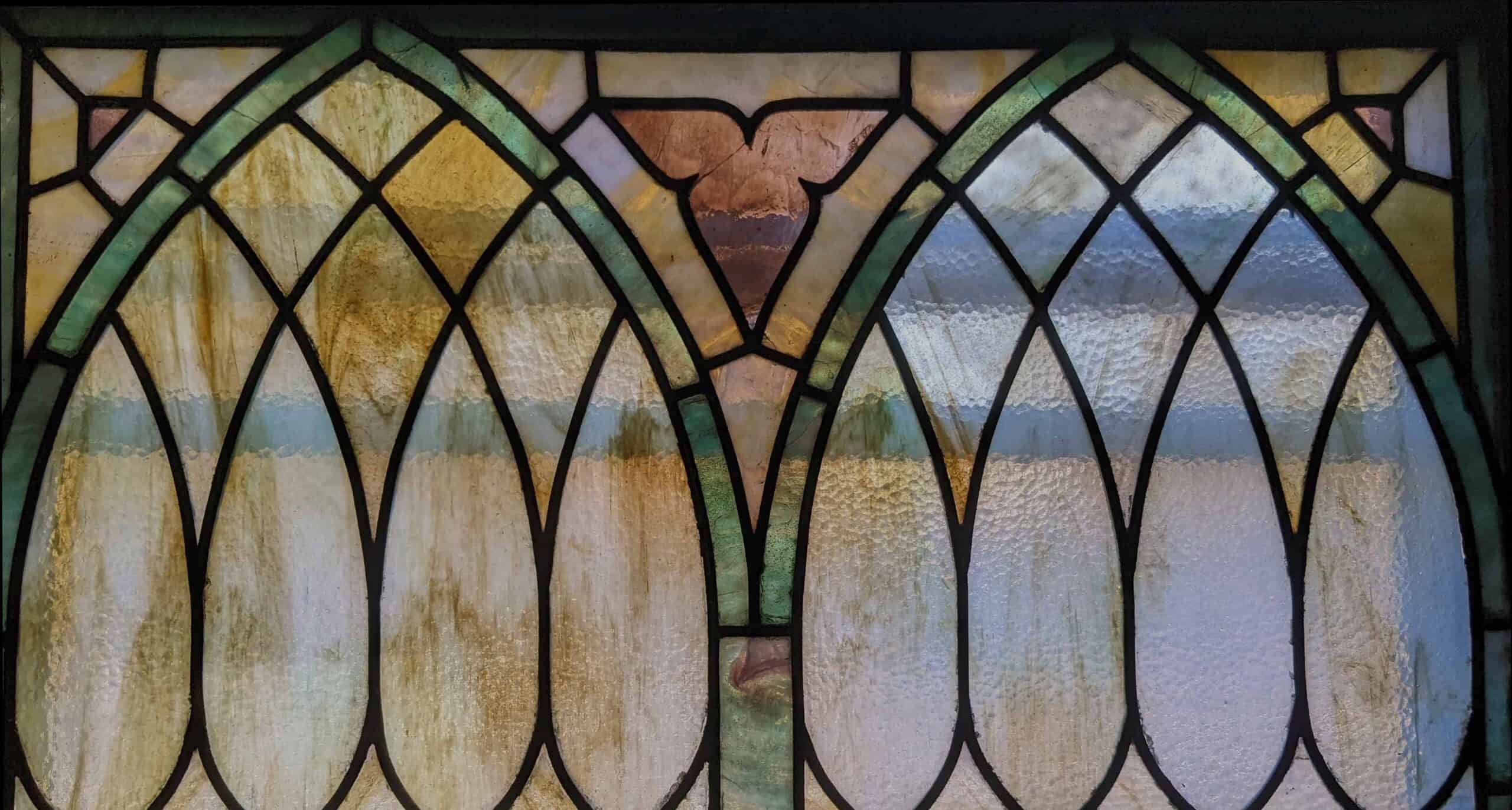
A historic landmark of great cultural significance, the Granite Church will open in spring of 2025 as a community and performing arts center.
Services
Brand Strategy, Logo Development
Branding a performing arts center is challenging enough - but what if that space is a century-old, historically significant landmark with strong ties to the community?

But after decades as a community hub, the church experienced dwindling attendance and eventually fell into disrepair, until it was purchased by BeFoundation in September of 2022.
The reimagined Granite Church will be transformed into a performing arts center and gathering place, helping unify the historic village of Georgetown for neighbors and visitors alike.

A transition of this magnitude requires a delicate touch. So we had to develop a mark that was both rooted in community values and modern, which could thus be embraced by future generations.
We spent time at the church, taking in its rich history, talking with residents and stakeholders, and immersing ourselves in the community of Georgetown. Through this, we gathered that the Granite Church represented three distinct and powerful values:
![]()
Georgetown is steeped in history, with a deep sense of community. Any mark would need to honor this sense of place and the values inherent therein.
![]()
The Granite Church stands for community. The Church has always offered a gathering point for the people of Georgetown – and so it would going forward.
![]()
A common theme in our conversations with residents and civic leaders was inclusivity – making the Granite Church a welcoming place for all.
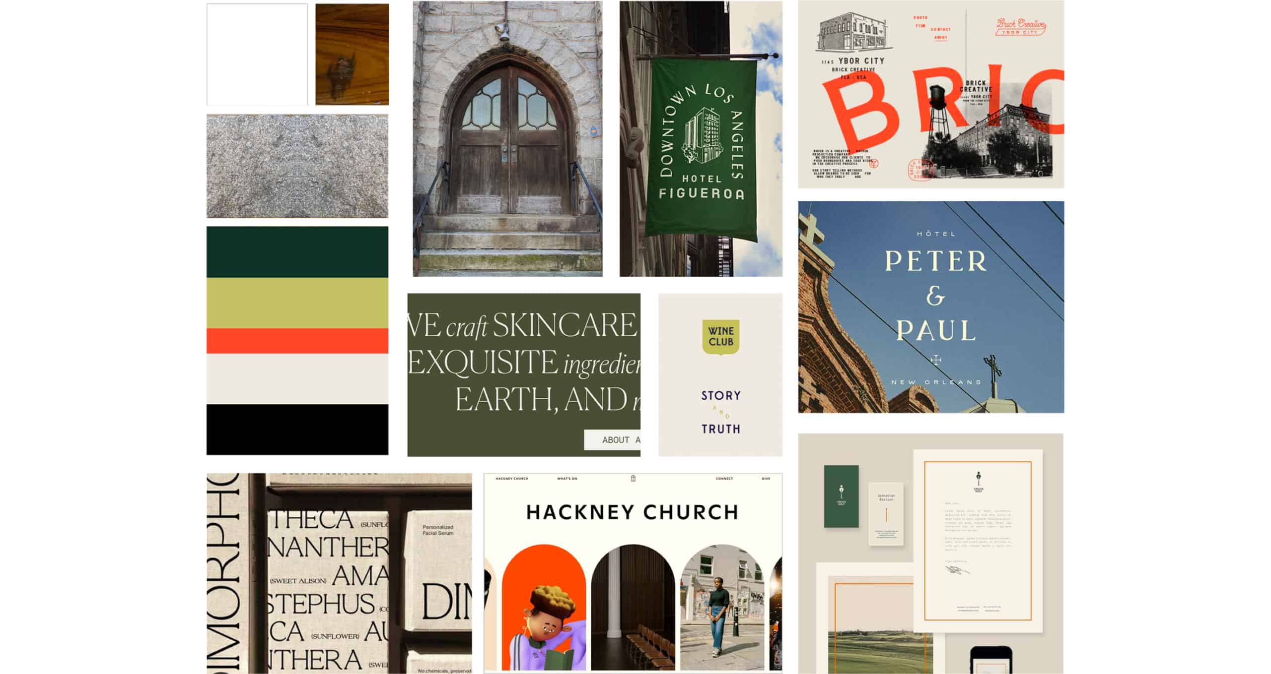
We began our creative exploration through the use of a mood board, drawing inspiration from images, color pallets and typography that we felt reflected the essence and values of both the church and its community.
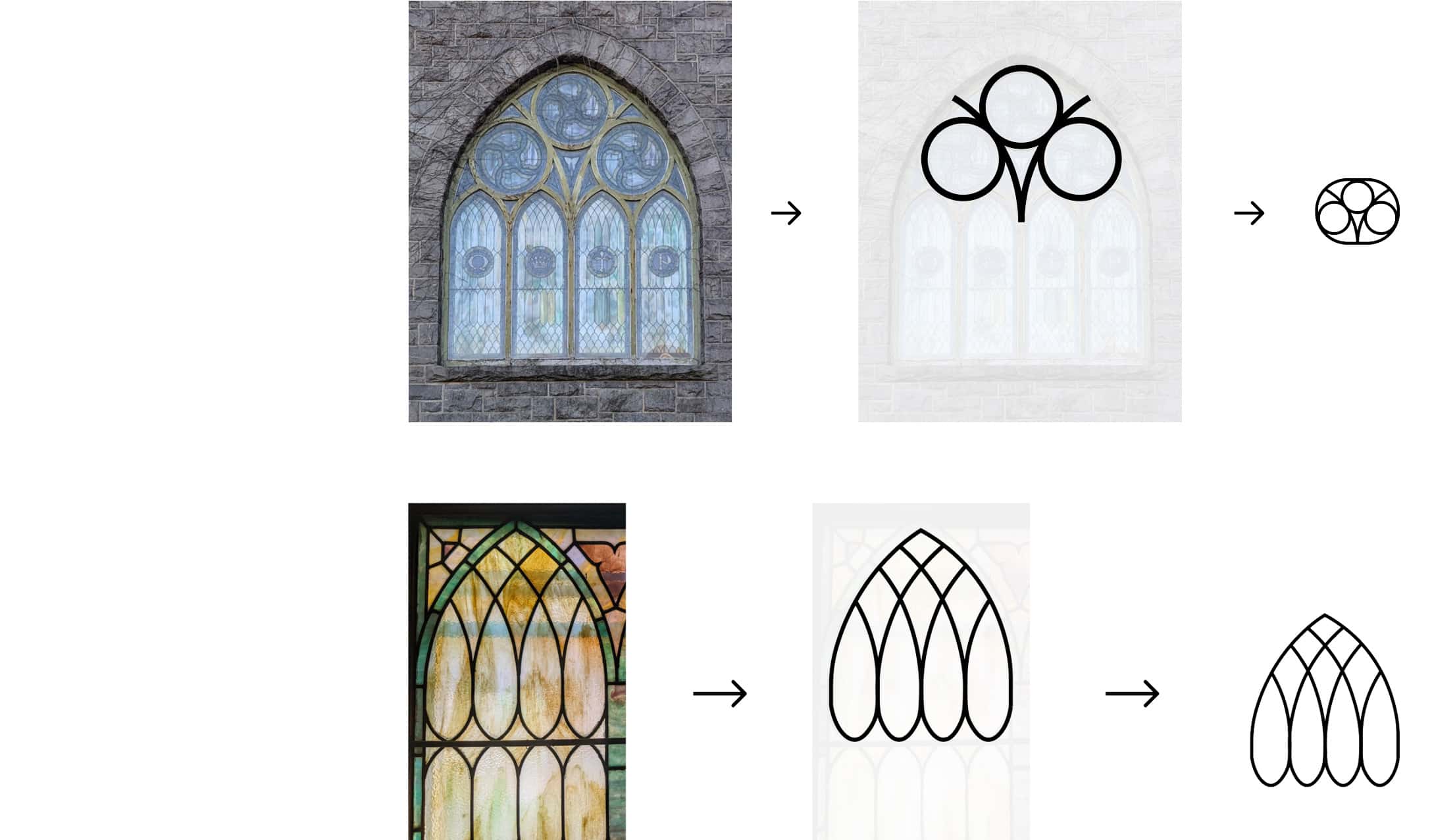
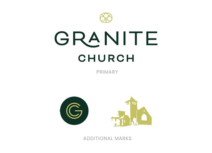
The creation of the client’s logo drew heavily from the building architecture itself. What components were most unique? Which provided the most visual interest? And importantly, which were most recognizable to the surrounding community?
In our research of Georgetown’s history and community, we also discovered a treasure trove of insignias, local correspondence and promotional items all of which provided a foundation for a logo direction.
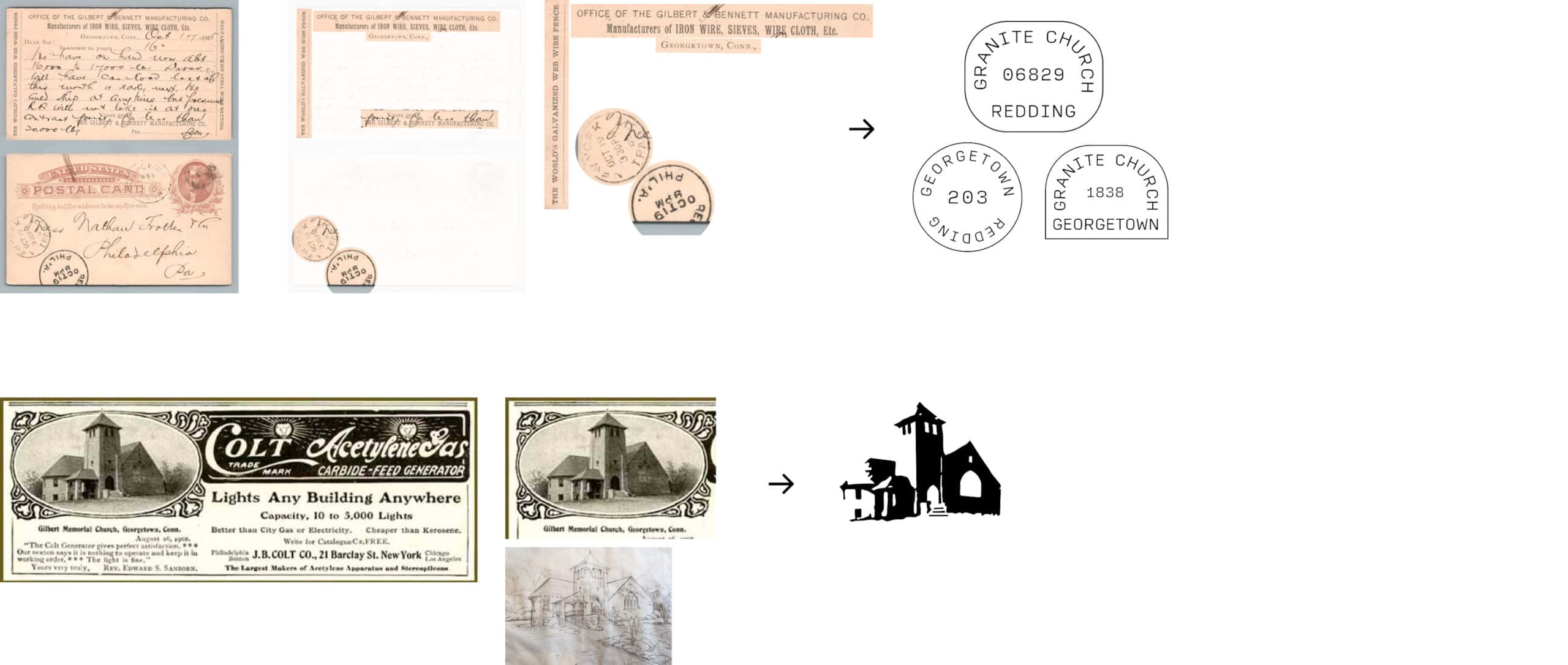
Our research and immersion into the Granite Church community inspired us to choose colors and typography that reflected a modern, artistic feel – with an element of sophistication, and that could easily be applied to a variety of print and digital media

We provided the client with three distinct directions, and one stood out of the pack, striking the right balance of contemporary style and respect to Georgetown values. We provided both an additional symbol and avatar that are currently being applied to apparel, signage and marketing materials. With time and use, we look forward to seeing this mark take on a life of its own, and represent the Granite Church for decades to come.
Rich Wenning // Executive Director, Be Foundation
Tell us how we can help by completing this brief form:
350 Springfield Avenue #200
Summit, NJ 07901
info@bcsinteractive.com
973.377.1175
As a digital marketing agency for nonprofits, we write about the work and campaigns we produce, and share what we’ve learned along the way.
Count Me InSign up for monthly marketing insights you can put to use right away.
Subscribe Here