September 3, 2020
Building a Student Recruitment Page That Converts
Fall is here, and that means student recruitment is under way, even if it will be a process unlike any we’ve experienced before. This year, using online channels to reach students and parents is non-negotiable, as travel and traditional means of in-person student recruitment are on hold due to the pandemic.
Whether your prospective students are coming to you from social media, online advertising, or word-of-mouth, you’ll need a place to greet them and guide them through to your admissions team. This will be your student recruitment landing page, and getting it right can mean the difference between a prospective scholar spending their academic career with you or with another school.
The Anatomy of a Student Recruitment Page
Different from your Admissions or Apply Here page, a recruitment landing page is the first glimpse of your school that a student or parent receives after having clicked on a recruitment ad, or having been referred from a social mention or emailed link. It’s your opportunity to convey to a prospective student that yours is the place for them and to inquire further.
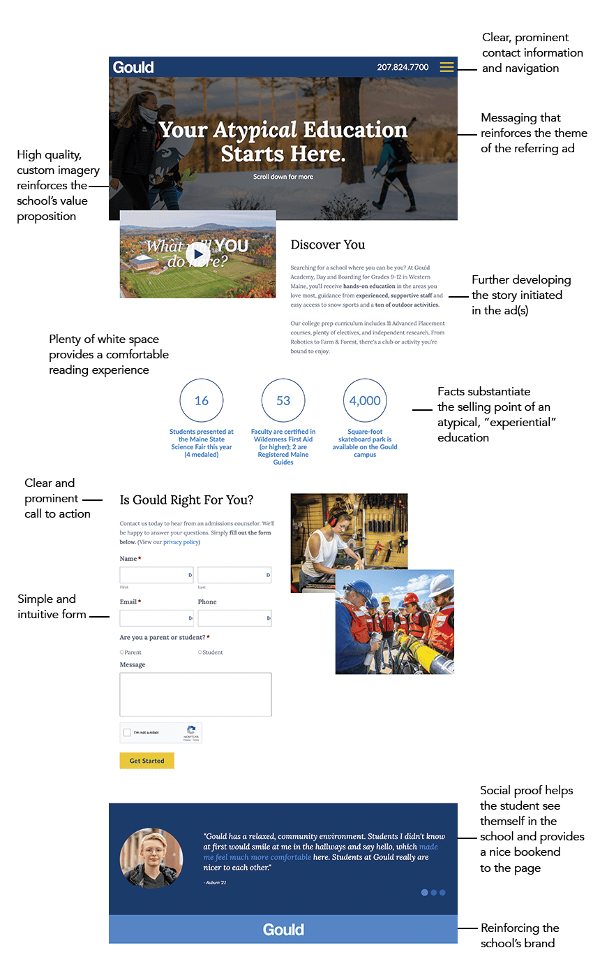
Below, I’ve provided an example of an actual recruitment landing page that we created for Gould Academy in Maine that resulted in nearly 100 inquiries in a 90-day period. I’ve highlighted in the example the elements that made the page work, but in short, an effective student recruitment page contains three attributes:
- 1. Consistency with the Original Touch Point
- A prospective student will typically arrive at your recruitment page after having clicked on some form of online ad. This might be a paid social media ad or a Google text or network display pay-per-click ad. Irrespective of ad type, it’s essential that the messaging, visuals and overall feel that the student experienced when they clicked on that ad is carried over to the recruitment landing page.
- Just as with an in-person recruiting experience, you’ll want to guide the student from initial contact to a deeper learning experience and then eventually on to an admissions professional. If the user has clicked on an ad that promised one experience or set of benefits and then arrives at something disconnected from that experience, their chances of losing interest and dropping off increase significantly.
- Don’t simply send a prospect to your homepage or admissions page with no point of reference as to why they arrived there. Instead, build a custom landing page that mirrors your advertising messaging and content, and guides the visitor towards a conversion.
- 2. Visual Appeal
- Good design sells. It elevates your school’s brand and conveys to an inquiring student or parent quality, stability and purpose. So, it pays to invest the time and resources in framing and designing a high-quality landing page. When built in combination with great advertising, the landing page will facilitate a strong, consistent story and move a student or parent further along their journey towards choosing your school.
- What constitutes good design?
- First, a clear hierarchy of elements. The page should capture the visitor’s attention with content that mirrors the original point of contact’s message and then guides them through to a call-to-action, along the way reinforcing benefits.
- Next, bold and beautiful imagery that helps define your school and establish points of differentiation. Invest in custom photography and/or video that will give prospective students and parents a genuine glimpse of what it’s actually like to attend your school.
- Third, clean design with adequate space that allows text and visual elements to breathe and saves the visitor from too much information or too many graphics. As you test your landing pages (I’ll write about this in a future post), you may find that visitors indeed prefer more information. But there is power in simplicity; we recommend starting with less and building from there.
- 3. Strong User Experience
- A great landing page provides the user with an outstanding user experience. All information should be provided clearly and concisely; all navigation and related processes should work smoothly. The page should never force the user to ask “How does this work?” “What does this mean?” or “What should I do next?” If you’ve built your page correctly, the only question a user should ask is “How do I find out more?”
- When planning your page, empathize with your prospective student or parent. What questions do they want answered? How can you make life easier for them? How can you entice them to take the next step in contacting you? Common sense is your best guide. If the page doesn’t work seamlessly for you, it certainly won’t for others.
- Here are other points to ensure that your student recruitment landing page offers a high-quality user experience:
- Your contact form is concise and easy to use
- The page provides an outstanding experience on all devices
- If hosted separately from your website, the page URL (web address) shows an HTTPs designation indicating that an SSL certificate is in place
- Contact information is prominent and accessible
The Recruitment Landing Page In Practice
Here’s a look at a landing page we created as part of a student recruitment campaign for Gould Academy in Maine. The purpose of this campaign was to share with prospective students and parents the unique, hands-on education (referred to as “experiential learning”) that Gould offers. (If you’d like to delve further into the campaign and its results, take a look at the case study).
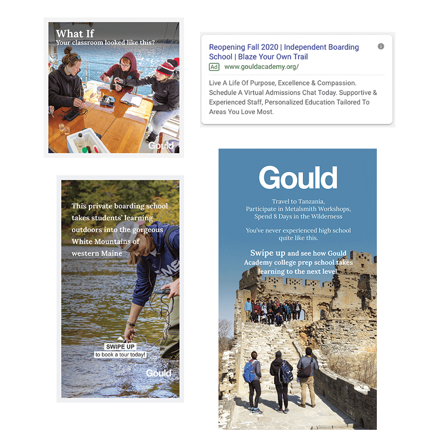
We deployed a series of ads like these across Google, Facebook and Instagram.

After clicking, the user arrived here:
 In sum
Applying rigor to the building of your landing page will not only drive more prospective students to your admissions team, but will set good practices that you can apply to all of your digital touchpoints. The key principles are to focus on the user, ensure consistency from your ads to your landing page and establish an appealing design that underscores your school’s points of differentiation.
Going forward, you’ll want to monitor your landing page’s activity, analytics and user interaction to refine the page for even better results. But that’s for a future post. Right now, let’s work on getting a strong foundational page in place. If you need help on that front, we’re only a call or email away.
TAGS: landing pages, online ad campaigns, student recruitment
Visiting?
Here we are.
350 Springfield Avenue #200
Summit, NJ 07901
info@bcsinteractive.com
973.377.1175
Are you ready to learn?
As a digital marketing agency for nonprofits, we write about the work and campaigns we produce, and share what we’ve learned along the way.
Count Me InSubscribe to the Blog
Sign up for monthly marketing insights you can put to use right away.
Subscribe Here