April 19, 2022
What the Best Nonprofit Websites Have in Common
Although Gary Vaynerchuk will say that social media is the most important marketing tool there is, we’re going to respectfully disagree (we still love ya, Gary). We’ve argued for years that a nonprofit’s website is the cornerstone of its marketing efforts. And as a nonprofit web design agency, we can attest that when it comes to promoting your mission and converting visitors into supporters, your website is the workhorse of your organization.
It pays then, to ensure you’ve designed, developed, and organized your website properly. But what constitutes great design? What’s an engaging user experience? Over time, we’ve learned that when it comes to building an outstanding site experience, it helps to draw inspiration from the best. So, as you’re thinking about the next iteration of your website, keep in mind these three qualities that the best nonprofit websites have in common:
1. Positioning
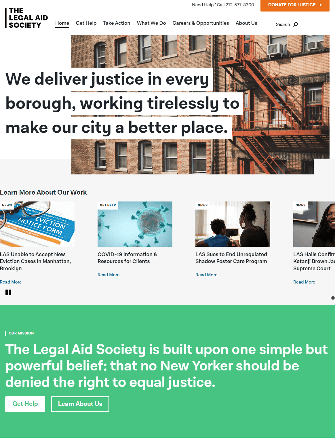
Distinct positioning is what differentiates one organization from another. Also known as Unique Value Proposition (UVP), the strongest nonprofits have a clearly articulated vision of who their audiences are and how their organization solves those constituencies’ problems. It follows then that the best websites are built around this positioning. An organization that does this exceedingly well is the Legal Aid Society.

Arrive at the Legal Aid Society’s site, and it won’t take long to understand who they serve or how they serve them. The name “Legal Aid Society” is indeed broad, and in passing, they could be everything to everybody. But their call to action defines a narrow focus on social justice. And geographically? Well, “they deliver justice in every borough” (of New York). All this in just 15 words, distinct and confident. Nice.
Venturing further into the site, you’ll notice that the content, labeling and overall user experience ties back to their Unique Value Proposition. This is how it’s done – choose a path and then continually educate and reinforce.
2. Clarity
Positioning is indeed the foundational element of a great website. But as we’ve taught before, even the best positioning is lost if it’s poorly communicated. The strongest websites are those that offer messaging front and center in clear, direct language that’s supported by relevant, hi-quality imagery and design.
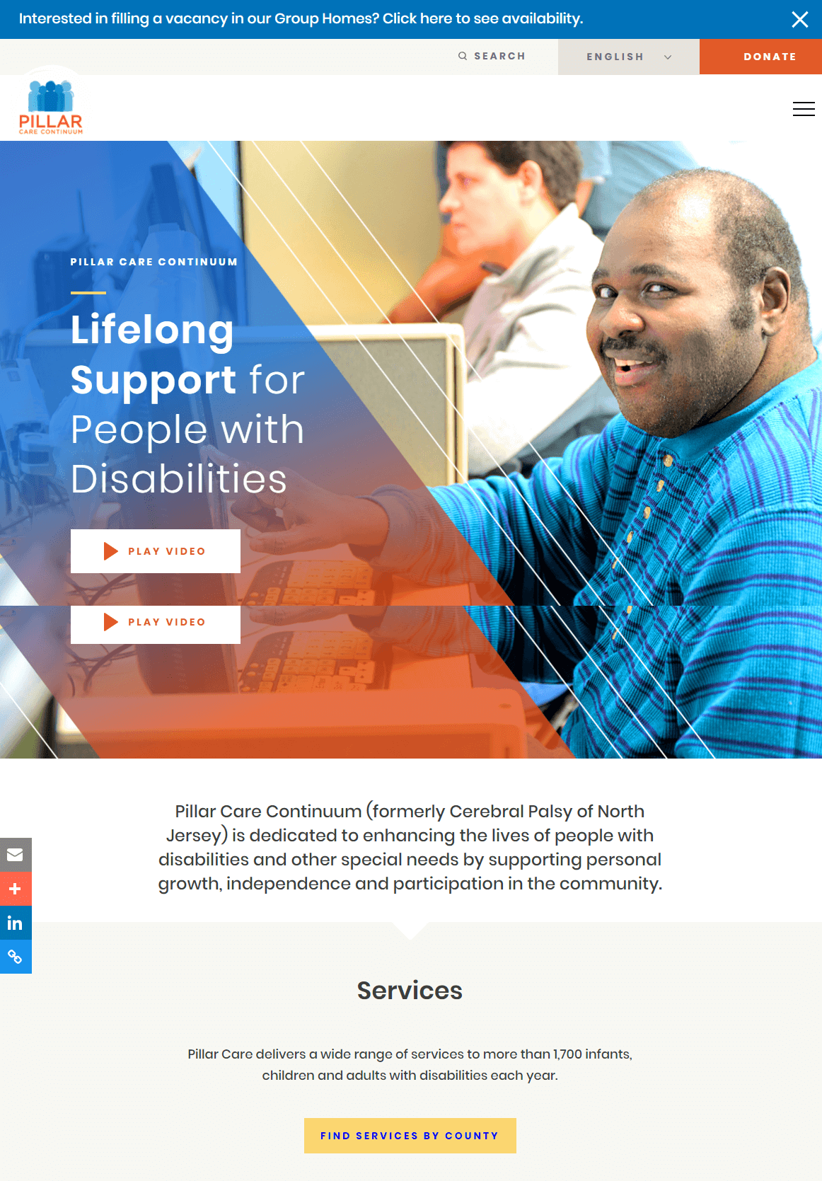
Take Pillar Care Continuum (not to brag, but this one’s ours). We worked closely with the client to ensure their core values and messaging about supportive, lifetime care were prominent and consistent throughout the site.

Strong positioning, conveyed through clear and direct messaging is a powerful combination. Here, families looking for service and care can find reassurance that the provider they’ve chosen is both experienced and qualified.
By delivering its value proposition directly and concisely, Pillar Care not only gets to the point quicker, but reinforce confidence in the visitor, who’s making one of the biggest decisions of their lives.
3. Connection
In addition to strong positioning and clear messaging, the most successful nonprofit websites connect with their audiences on an emotional level. As a nonprofit web design agency we thrive on the fact that nonprofits have compelling stories to share. It’s important to leverage those stories to connect deeply with site visitors, and thus transform users into potential stakeholders.
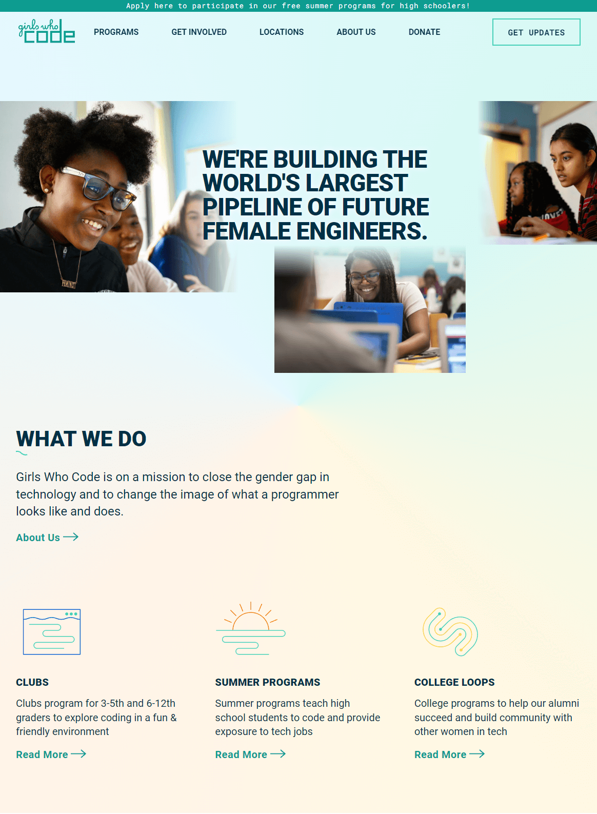
Girls Who Code is an outstanding example of a website that’s positioned properly, that communicates its mission effectively, and that also connects with visitors on an emotional level.

The GWC website does a great job of speaking to parents who wish to empower girls and non-binary students:
- Their language is aspirational. They’re building the “largest pipeline of future female engineers,” something that many parents would want their children to be part of.
- They use imagery to connect to their audience emotionally. The homepage features young girls of a variety of ages and backgrounds immersed in, and enjoy thing process of coding
- Overall, the site’s layout and user experience supports the idea of empowering girls with skills and confidence that can unlock substantial possibilities
By engaging their audience through a clear, focused message, their website does the heavy lifting of their marketing, moving donors, volunteers, and parents to take action and, ultimately, support their reason for being.
Bringing it All Together
As a nonprofit web design agency, we’re true believers that an organization’s website can make the difference between thriving and just getting by. Reaching that higher level of success requires a serious investment of time, resources and organizational buy-in. But knowing what makes a great website great is a good first step. When assessing your own site’s effectiveness, use the three qualities we discussed here – Positioning, Clarity and Connection – as a framework to plan what needs to be done. If you see weaknesses in one or more of these areas, it might be time for some work.
If we can help on any of the items discussed here, let us know, we’re only an email away.
TAGS: best nonprofit websites, clear messaging for nonprofits, nonprofit website technology, unique value proposition
Visiting?
Here we are.
350 Springfield Avenue #200
Summit, NJ 07901
info@bcsinteractive.com
973.377.1175
Are you ready to learn?
As a digital marketing agency for nonprofits, we write about the work and campaigns we produce, and share what we’ve learned along the way.
Count Me InSubscribe to the Blog
Sign up for monthly marketing insights you can put to use right away.
Subscribe Here