September 30, 2020
How to Approach Nonprofit Website Photography
Why does someone donate to your nonprofit or foundation?
There are a few reasons:
- Your mission aligns with their values and passion
- They see that their contribution can have an impact
- They consider you trustworthy as they see their own peers give
While you should continually work towards developing all of these prompts, there’s an additional factor that drives giving over which you’ll have the most influence: your ability to move people to give.
Giving is an emotional decision, and the stories your organization cultivates can create the urgency and emotional connection needed to prompt a donor to action. Great nonprofit website photography can provide the foundation for these stories.

Every day, you’re telling your story across all of your online channels, but your website is the place where visitors can immerse themselves in your cause, away from the Wild West that is social media. Here, potential donors can deliberate on their own terms and if so moved, offer financial support.
But there’s more to nonprofit website photography than just choosing images. You should be thinking through how those images support your story and the resulting actions you want your users to take, and only then worry about how to secure the right photography. In short, you need a plan.
Developing Your Story
The first step is simply to decide what you want to say. Start with your mission. Whom do you serve? Why does your organization exist? You already know the answers. If you’re satisfied with how you’ve written about your mission on your website, then you can consider how images will reinforce your messaging in the hearts and minds of your audience. If you’re in the process of redesigning your website, this is prime time to assess your story from the ground-up, and planning and orchestrating images will be a natural part of that work.
Deciding on Composition
Using your storyline as a guide, start to think of the specific messages you want each of your images to convey. This refers to the composition of your photos–what do you want your subject matter to be and what do you want taking place in those photos to suit your core idea or goal? Thinking about composition serves two purposes; first, it helps you decide what will best support your narrative; second, it will guide how to direct your photoshoot or, if you’re using stock imagery, what types of images to purchase.
Composition isn’t something to be left strictly to your photographer or marketing director. Remember that imagery is part of story, and story is the responsibility of the entire organization, from the executive director down. Stakeholders who don’t normally play a role in marketing or communications should take part in this process, and in doing so, will rally their entire team around the mission.
Developing composition doesn’t require artistic ability or special tools. Simply start by understanding your overall story, and then consider the messaging on each page of your website. Jot down what you want your images to convey in support of each page’s message. Taken together, this content should convey a coherent story that leads to an end goal, whether that’s donating, volunteering, or another desired action.
Nonprofit Website Photography in Action
Here are some examples of how storyline and image composition work to guide a user towards a specific goal.
The New Jersey Conservation Foundation preserves and provides stewardship of land throughout the state. Their website is designed to immerse the user in New Jersey’s open spaces. The more their imagery can convey the beauty of what’s being preserved, the more likely they are to receive the funding to protect more land.
On their website, images like these engage visitors around the idea of land preservation:
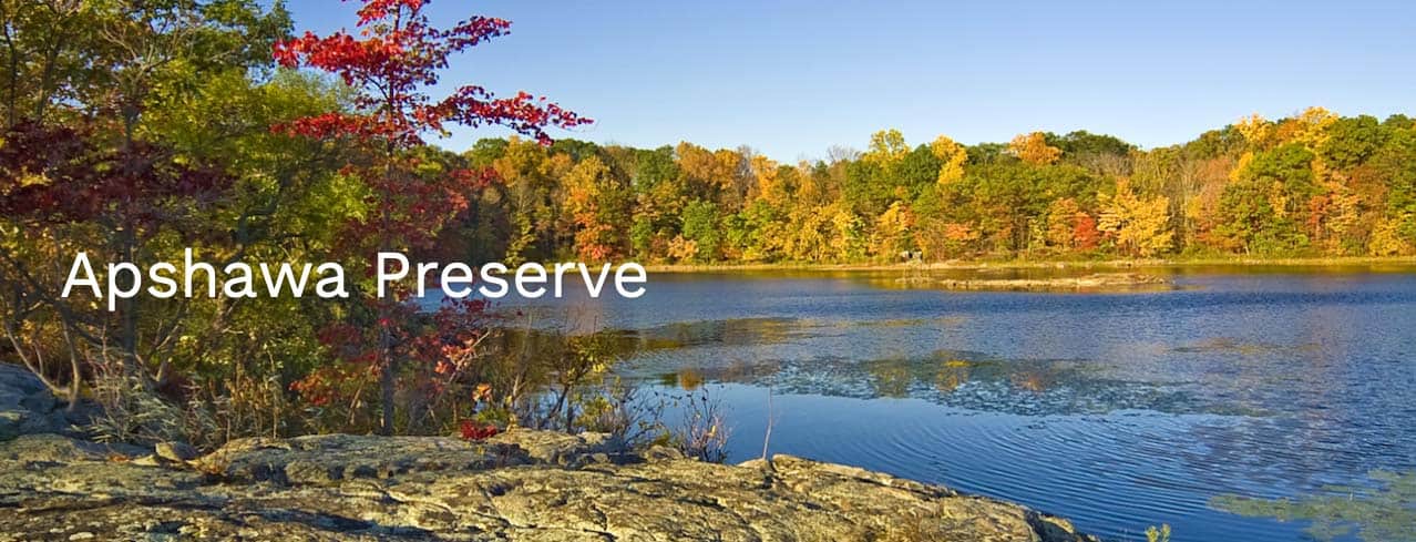
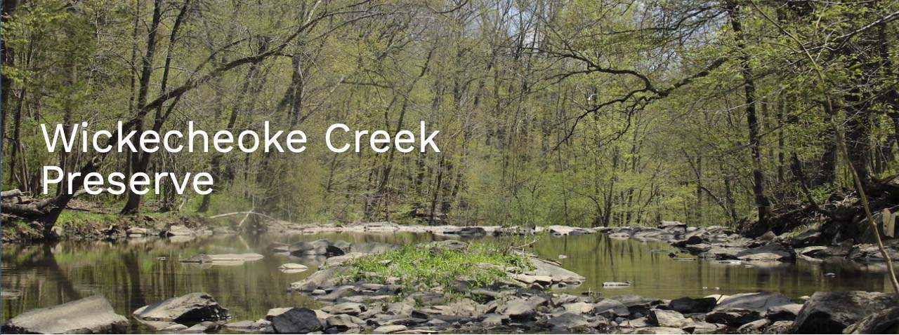
As the visitor learns more about the natural landscapes available for their enjoyment and the necessity of land preservation, they’re then prompted to consider donating in support of the cause:
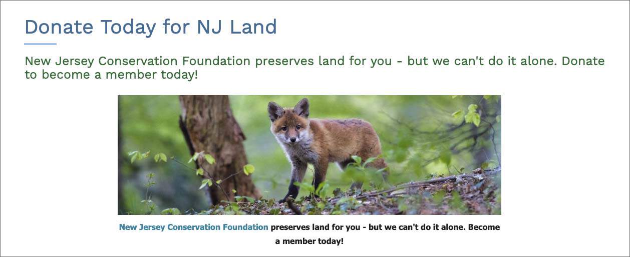
While they have the users’ attention, the foundation pulls out the big guns–an image of this little guy (it’s a red fox)–to make the ask. It’s not fair, right? And yet, it’s a great example of using imagery to connect with a visitor and gain their support.
Private boarding school Gould Academy distinguishes itself from other New England-based schools by showcasing their unique, “experiential” educational model, whereby students learn in the field and in environments that provide an intensive, hands-on appreciation of their subject. The Gould website features images of real students in situations of real, experiential learning:
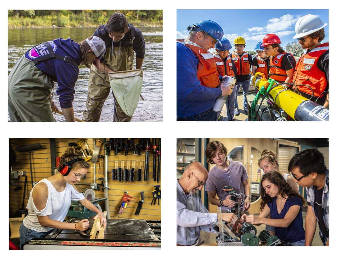
The images and their composition are designed to pique prospective students’ interest, but are also framed so that the student can see themselves in those learning environments.
Once engaged, the student or parent is guided to a landing page that continues the theme of experiential education and invites them to learn more about applying to the school.
How to Secure Great Images
Once you’ve developed your story and have decided on what role you want your images to play, you’ll now actually have to secure those images. This is the easy part; you’ll have three options:
- Take the images yourself
- Hire a professional photographer
- Purchase stock imagery
If you or someone on your team is an experienced, skilled photographer with high-quality equipment and a deep understanding of all of the facets of photography, you may want to take the helm yourself. But never simply delegate your photography to a less-than-experienced team member simply to save time or costs. Poor or disingenuous site photography can turn away donors and cheapen visitors’ perception.
Hiring a Pro
Instead, if resources allow, hire an experienced, professional photographer to shoot custom imagery for your organization. You’ll pay more, yes, but the value you’ll receive far outweighs the costs. Consider that a professional photographer:
- understands composition, lighting, depth of field, and orchestration and can thus create images that will engage and persuade your visitors – and isn’t that why you’re relying on imagery to begin with?
- has experience taking direction from creative teams or website stakeholders, so they’ll better grasp the look and feel you’re hoping to achieve
- can work with your subject matter, whether that’s your staff, the beneficiaries of your mission, or a non-human subject to evoke the most genuine portrayal of your work, which is the most powerful characteristic you can harness to communicate your message.
If you want to explore hiring a pro but don’t know where to start, drop me a line and I can refer talented individuals with whom we’ve worked closely.
Stock Imagery
I don’t recommend using stock photography. By definition, the subject matter won’t reflect your specific mission or organization and will thus lack the authenticity you’ll need to engage your audience. Moreover, unless you’re willing to pay for the best stuff, the quality of composition and overall creative direction are lacking. Still, in situations where budget is tight, or where you simply need to fill some storyline gaps or capture an inanimate object, stock is a viable option.
If you’re going to go the stock route though, I implore you to pick the highest quality images you can. Use the same attention to detail, quality and composition that you’d apply to custom imagery. You must at all costs avoid the quintessential “stock” image:
 In terms of where to shop for stock imagery, Getty Images still offers some of the best, but most expensive, stock photography available. Shutterstock offers more affordable options, although for many subject areas, you’ll have to search a bit to get past Mr. Successful on the right here.
Over the last few years there’s been a movement toward offering affordable, better quality stock photography, so in addition to the mainstream sites noted above, you might want to check out this blog post, aptly titled Stock Photos that Don’t Suck to see what else is available.
When selecting stock photos, be sure to understand and secure the appropriate rights for every image you purchase. Even if you accidentally post an image without first having secured rights or permission, you will still be liable; at best, you’ll be asked to take the image down; at worst, you’ll be fined.
**********************************
I hope you found this mini-guide to nonprofit website photography helpful. There’s quite a bit here, and in truth, I just scratched the surface, so if you have questions or have thoughts on planning photography for your own site, reach out to me here. Happy picture-taking!
TAGS: custom photography for nonprofits, nonprofit website photography, stock imagery for nonprofits
Visiting?
Here we are.
350 Springfield Avenue #200
Summit, NJ 07901
info@bcsinteractive.com
973.377.1175
Are you ready to learn?
As a digital marketing agency for nonprofits, we write about the work and campaigns we produce, and share what we’ve learned along the way.
Count Me InSubscribe to the Blog
Sign up for monthly marketing insights you can put to use right away.
Subscribe Here